One of Daniel Wilson’s recent videos on YouTube going after my friend Del Bigtree. In this article, I’ll show you how Dan’s explanations are “hand-waving” with no calculations to back them up and when you ask him for the data he points you to a page with no data and then mocks you for not being able to find what is not there.
I asked Dan Wilson aka “Debunk the Funk” to explain the Ontario data showing a 39% increase in deaths from COVID in the year after the vaccines rolled out.
He wrote back essentially that it is because lockdowns lowered deaths in 2021, it’s no surprise that the COVID deaths increased in 2022.
I immediately saw the flaw in this argument because I had read a certain paper (more on that later).
If you know exactly what I’m talking about, you qualify for my elite “debunk the debunkers” team for future debunks. Be sure to sign up here.
When I asked him for the underlying data (since he didn’t cite his source), he deliberately misdirected me to a page which had no data at all, then he mocked me for being incapable of finding the data.
He finally sent me to the page with the charts he used, but I wanted the source data.
He did not give me the death data source data, and instead did a screenshot of the hospitalization page. So I found it on my own and it has data only up to mid-2022.
He basically wasted my time on a wild goose chase before finally giving me this link of the death data for vaxxed vs. unvaxxed in Ontario.
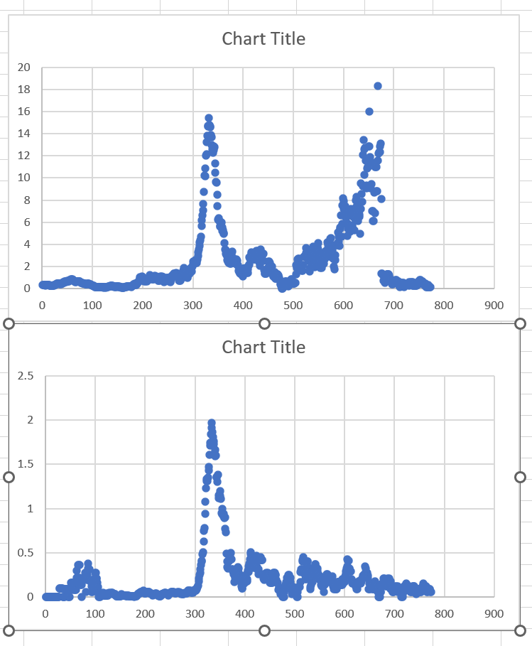
I plotted the unvaxxed rates and the vaxxed rates below for the 60+ age group. Look what I found:

I documented the deliberate misdirection and him mocking me for not being able to find what is not there in this video:
Then I wrote up five ways to debunk his explanation and added it to my original article, “COVID deaths up 39% after vaccines rolled out in Ontario Canada.” It includes the paper I alluded to above. Can you guess which paper I’m talking about?
Hint: It’s 62 pages long and the authors work at a top university and it was viscously attacked in the media, but if you read it, you’ll be very impressed. All my “misinformation spreader” friends have high praise for this paper.
Did I miss anything in my five ways to counter his argument?
I have greater respect for Daniel Wilson than Ian Copeland.
Copeland refused to supply an explanation and then went on twitter to explain it was the variants. Also, Copeland is nearly 100% insults in his conversations and Wilson is around 50-50.
By contrast, Wilson is familiar with the data and the papers and on the surface, makes arguments that sound plausible if you aren’t familiar with the literature.
Susan Oliver (and her dog Cindy) I actually respect more than Wilson because Susan (or maybe it is Cindy working behind the scenes) actually does a lot of work in researching her videos such as the one she did on Mark Skidmore’s paper. But she deliberately neglects to show you her “corrected” result on the Skidmore paper. So she’s not an intellectually honest scientist at all. If you make the minor corrections that she points out, the results are still devastating for the narrative which is why she says nothing.
It’s funny that when I ask people to explain the Ontario result, I get different answers from different people. All of them hand-waving.
That tells you pretty much everything you need to know.
None of them can explain the data.
That’s the problem they have. The data is the inconvenient truth.
**Source: Daniel Wilson, PhD: A master of misdirection
